如何用seabron生成柱状图和散点图
时间:2023-10-07 | 栏目:可编程逻辑 | 点击:次
生成柱状图
柱状图是我们经常会见到的数据图表,每个柱状都表示一组数据
import seaborn
import matplotlib.pyplot as plt

months = ['Jan', 'Feb', 'Mar', 'Apr', 'May', 'Jun']
sales = [100, 200, 150, 400, 300, 350]


plt.xlabel('Year')
plt.ylabel('Sales')
plt.title('Sales by Year (Heatmap)')

seaborn.barplot(x=months,y=sales)  # 使用seaborn配置柱状图的X轴和Y轴
plt.show()
运行代码生成柱状图

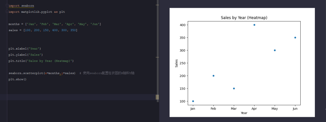
生成散点图
散点图顾名思义,每个表里面的一个点就代表着一组数值
import seaborn
import matplotlib.pyplot as plt

months = ['Jan', 'Feb', 'Mar', 'Apr', 'May', 'Jun']
sales = [100, 200, 150, 400, 300, 350]


plt.xlabel('Year')
plt.ylabel('Sales')
plt.title('Sales by Year (Heatmap)')

seaborn.scatterplot(x=months,y=sales)  # 使用seaborn配置散点图的X轴和Y轴
plt.show()